

What is Rich Black CMYK and how to get it For Printing?
2025-05-22 08:11:22

Getting the perfect black color is the dream of every industry, not just apparel. Despite being the darkest in the color wheel, there’s something oddly satisfying about this color. This is why most brands look for that rich black CMYK when printing packaging boxes. Read on to find out everything you need to know about rich black CMYK and how different it is from other types.
What is CMYK?
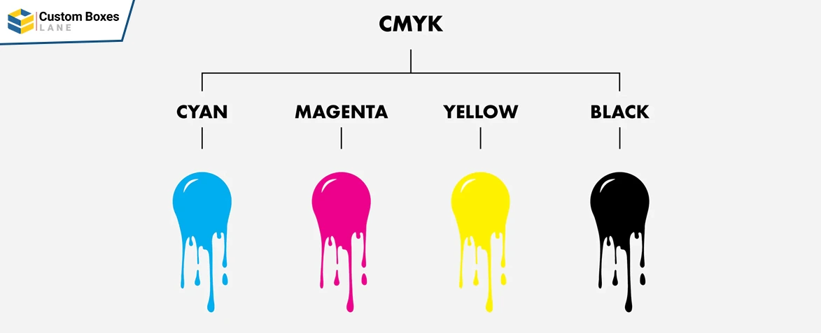
Before diving deep into the details of rich black and how to get one for your packaging, let’s have a look at CMYK. This combination of letters is a code that represents the names of colors. Each letter represents a different primary or secondary color, for instance:
- C stands for Cyan
- M stands for Magenta
- Y stands for Yellow
- K stands for Black
Most people ask why is black k in CMYK, there’s no right or wrong answer to this question. Black is often referred to as Key, hence the letter K in CMYK. You can get different concentrations for each color to get a new color. Lower percentages mean lighter colors; however, this does not mean 100% of each color is pure black. The different concentrations or percentages in CMYK give us different colors. For example, to obtain a powder blue color in CMYK, you get the following percentages:
- C: 23%
- M: 3%
- Y: 0%
- K: 10%
Why Use CMYK?
Now that you know what is k in CMYK, it’s time to see why people choose CMYK when printing packaging boxes. CMYK is preferred over RGB because it offers a dark and deep black color. In other words, if you are to get a CMYK rich black, or just rich black, you need the concentration of Black in there.
Why 100% CMYK is Not Used?
As mentioned earlier, the kind of CMYK black most brands are looking for is not made after adding 100% concentrations of each color. Doing so gives us a different kind of black, one not admired by people globally. Here are a few reasons why printing companies do not go for complete percentages of every color to get black:
-
It is Expensive
When you choose 100 percent for each color, you are adding a lot of color individually. This means you get to spend more money on the colors. The whole process is expensive, and when the desired result is not what you were looking for, all of it goes to waste.
-
The Prints are Heavier
Aiming for a 100% concentration of CMYK for black will result in physical copies being heavier than the other black colors. When you add more ink to the paper, it tends to get heavier. Eventually, the result does not give a good impression.
-
It is Not a Sustainable Practice
When you are looking to be a sustainable brand, choosing 100% concentrations is not a good practice. Adding more concentrations means you are using more ink than usual, resulting in exhausting the resources. Thus, this is not a sustainable practice.
-
It Gives a Dull Black
Surprisingly, this rich concentration doesn’t even give a rich black. The result does not give a beautiful dark color. So, unless you are looking for a dull black that looks like it belongs more to the gray family than black, don’t use it.
Types of Black in CMYK
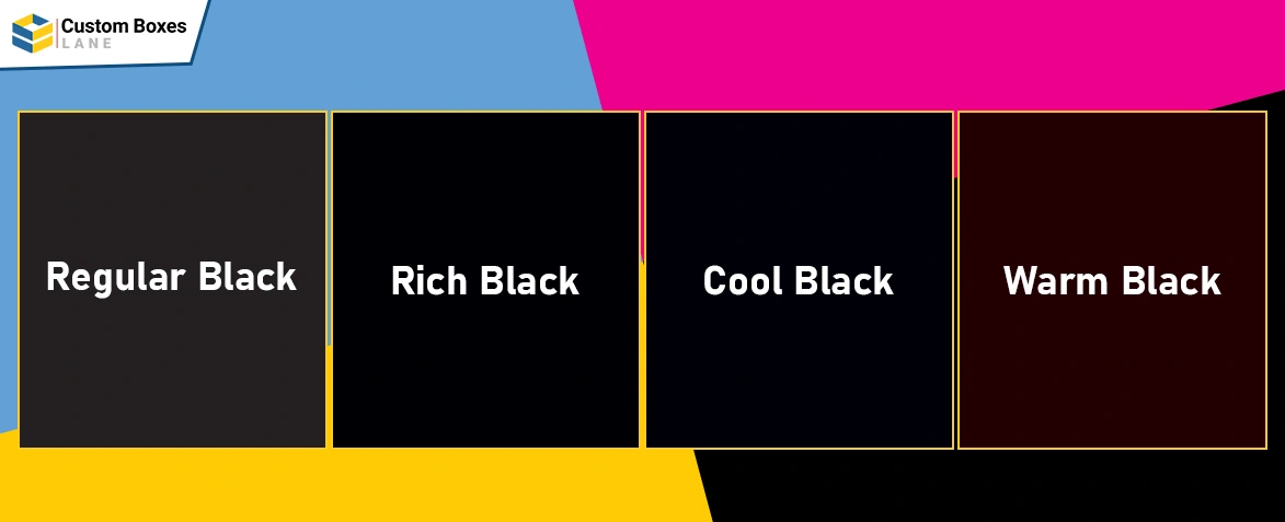
Print in black has different shades as you change the concentrations for each color. This is how brands choose different types of black colors for their packaging boxes. It is important to remember that pure black color code in hex is #000000. Let’s have a look at these four types found in CMYK printing:
-
Regular Black
Regular black or negro cmyk is achieved by keeping the Black color concentration to a 100% and the rest to 0. This color gives a better shade than when you switch all colors to 100%. However, it is still not as dark as the rich black color usually used.
-
Rich Black
Rich black is what most brands use for their packaging and even for dresses and shirts. People always look for a good black. Rich black adds other colors to the printing as well. The concentrations are C = 60, M = 60, Y = 60, K = 100.
-
Cool Black
Cool black leans a bit toward blue, however, it is hardly noticeable to the naked eye. The concentrations for getting a cool black CMYK are C=60, M=0, Y=0, K=100. Cool black is generally used when black is used less in design.
-
Warm Black
Warm black has slight undertones of darker shades, such as brown. The concentrations for getting a warm black on paper are C=0, M=60, Y=0, K=100. This gives a beautiful black and is often used by brands when printing their packages.
When is Regular Black Used?
Regular CMYK black color is used when other colors are also used in the design. For instance, if there are prints in which the design has minimal black or it is only used for font, regular black is used. This is what you see in most packaging boxes. Regular black looks very rich when contrasted with other colors. This is why it’s a common practice to use it when your packaging is very colorful.
When is Rich Black Used?
Rich black is used when the color black is used more than any other color. Complete black boxes with little to no design on them use rich black concentrations. The CK code for black in this printing is C=60, K=100. This is the color you see when shopping for an ‘all-black’ outfit.
You can always experiment with the concentrations to see which black is what you truly want. Adobe posted the Gargantua black hole color code from the movie Interstellar with the following concentrations:
- C= 0
- M= 27
- Y= 45
- K= 96
Decide the Right Black Color for Your Packaging Boxes
Now that you know the difference between plain black vs rich black, it’s time to decide which color you want to go with. You can choose the right color based on the amount of black being used in the packaging. When using black boxes with gold or red font, the best practice is to choose rich black. You can always get expert advice before placing an order by contacting Custom Boxes Lane for your custom packaging needs.